The answers were all there, just in the wrong order
Canyon sells direct, so its product page does the work of a shop and a salesperson. How might the Canyon app help a rider choose, fit and pay for a bike with confidence, at the moment each question comes up?
Role
Product Designer (self-initiated)
Scope
Product page (PDP), Canyon iOS app
Status
Concept, ready for user testing
Tools
PDP redesign · Canyon AppSize first. Price always visible.A size-first page, a test ride at the moment of doubt, a sticky live total and a two-step checkout sheet.
A shop without a salesperson
01
Most Canyon riders choose and pay for a bike worth thousands of euros on a phone screen. Test rides, pick-up and servicing exist through Canyon’s Experience Partners, but the product page is where nearly every buying decision happens. A rider arrives with three questions a shop assistant would normally answer.
01 · Fit
Will it fit me?
There is no test ride on a phone, so the frame size feels like the riskiest choice.
02 · Cost
What will I pay in total?
Insurance, delivery and extras all move the price after the first number.
03 · After
What happens after I buy?
Delivery, assembly, service and returns decide whether buying unseen feels safe.
!
The key insight
The current app already has an answer to every one of these questions: a size recommendation, test rides, a 6-year guarantee, 30-day returns and pick-up at a partner. The problem isn’t missing content. Each answer arrives after the moment the rider needed it.
Scope
The PDP in the Canyon iOS app
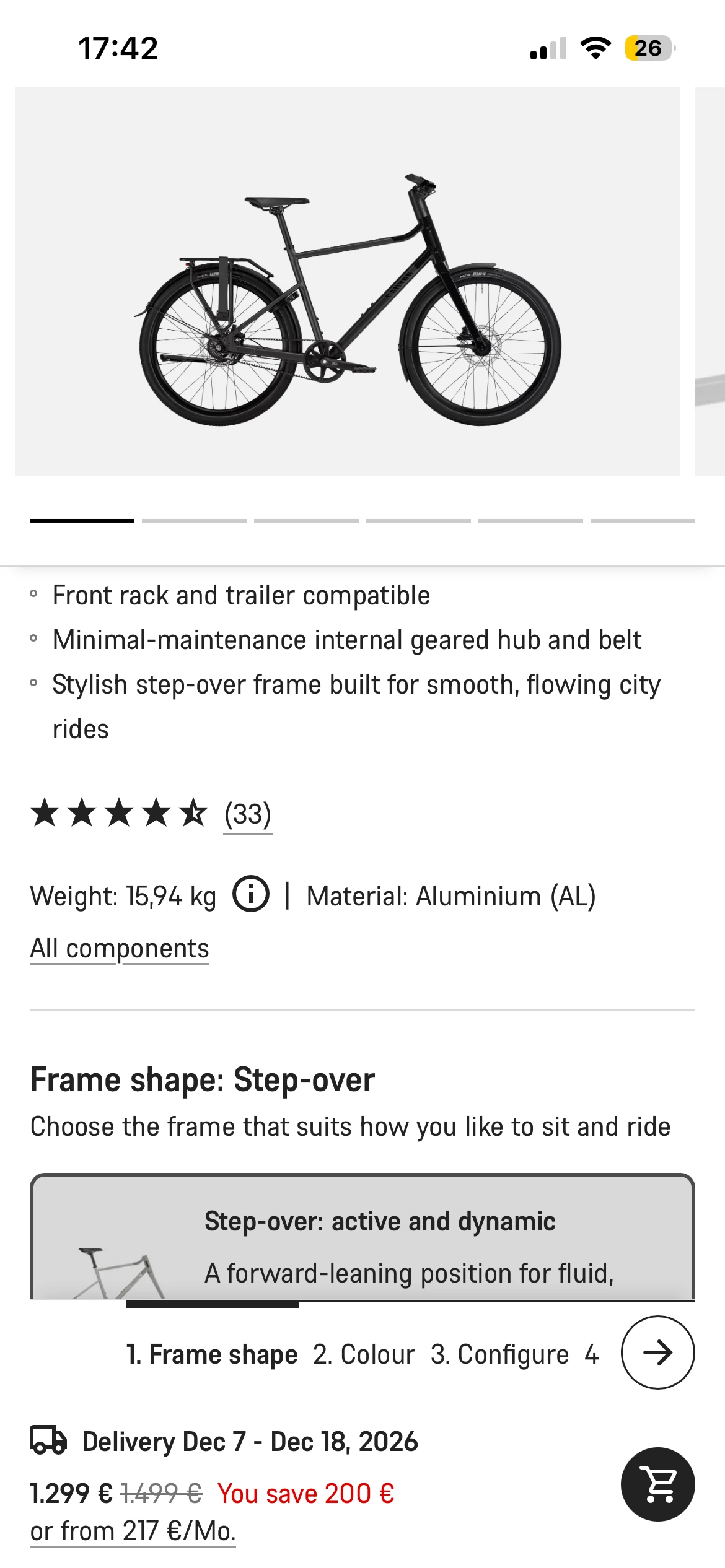
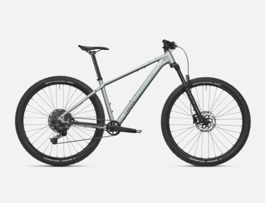
Canyon runs two PDP templates: one for Citylite, and one shared by every other family (Roadlite, Aeroad, Ultimate, Grand Canyon and more). I studied both, using the Citylite and the Grand Canyon AL 6. The product list, filters and compare are left for a follow-up study.
Constraints
Designed from the outside
I had no access to Canyon’s analytics, research or design system files. Business goals such as accessory sales and insurance uptake are treated as real goals. Legal text is moved, never removed, and would be confirmed with legal.
Before and after
⇔
CurrentRedesign
Every answer, at the moment it’s needed
Same bike, same content, new order. Drag across the phone to compare.
FitSize sits right under the price, the recommended size is pre-selected, and a test ride is offered right there.
MoneyA sticky bar keeps the live total and delivery date in view at every step.
ControlAccessories are optional tiles on the page, not a detour after choosing a size.
ReassuranceGuarantee, returns, pick-up and assembly in one row of promises.
ConsistencyCitylite moves onto the shared template, built from eight components.
Following the rider, not the layout
02
Step 01
A walkthrough with a real goal
I went through the app as a rider would: “buy a hardtail for weekend trails, size unknown”. I did the same for a Citylite, from the product list to the cart, and recorded every screen.
Step 02
Mapping each screen to a question
For each part of the page I asked which question it answers (fit, cost or after-purchase) and whether it answers it when the rider is asking it.
I deliberately left out cosmetic issues. This study is about the order and timing of decisions, because that is what decides whether a rider buys with confidence.
Five problems between the rider and a confident purchase
03
Ordered by what a wrong decision costs the rider: first fit, then money, then control.
1 Fit2 Money3 Control4 Reassurance5 Consistency
Size, mid-page
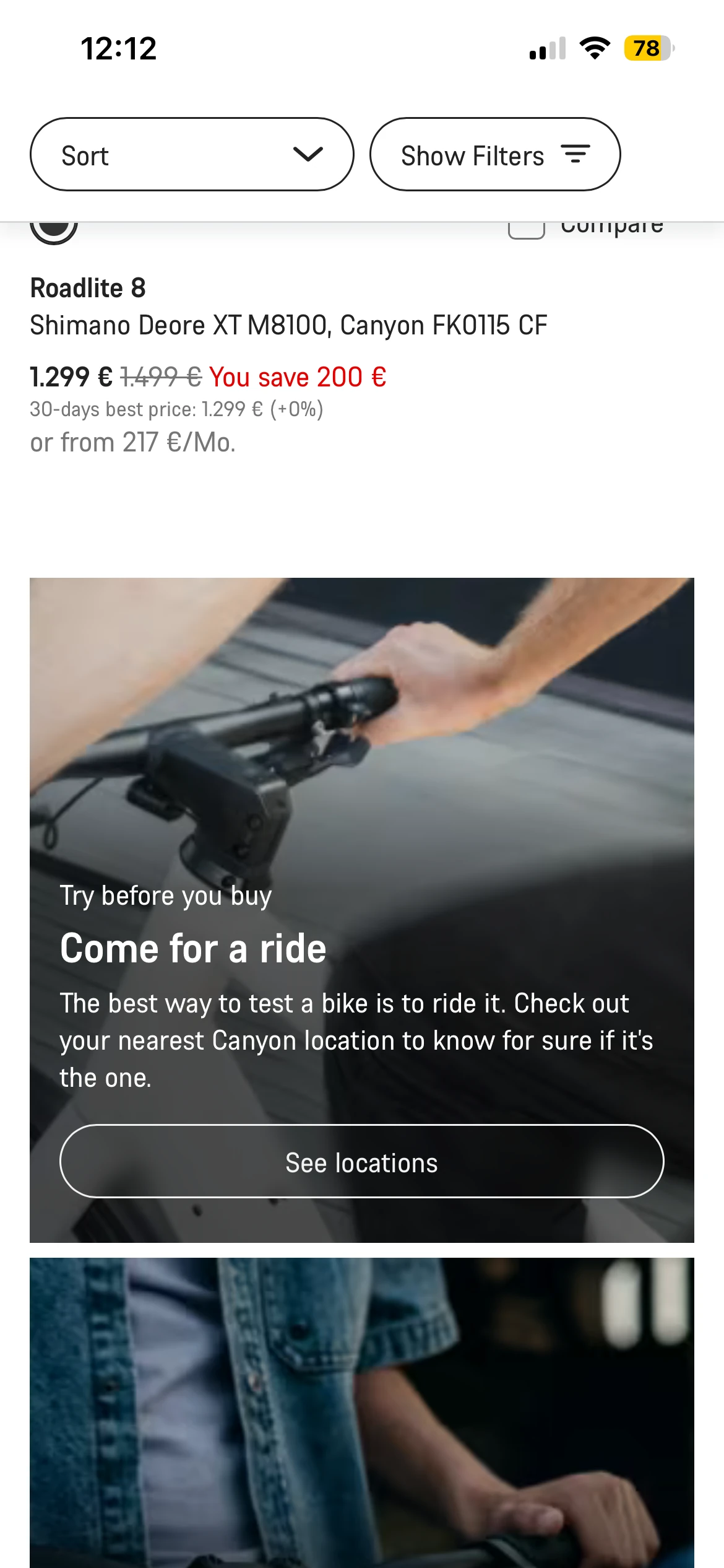
Test ride, end of list
1Fit
Fit is answered too late, and the best answer is hidden
What happens
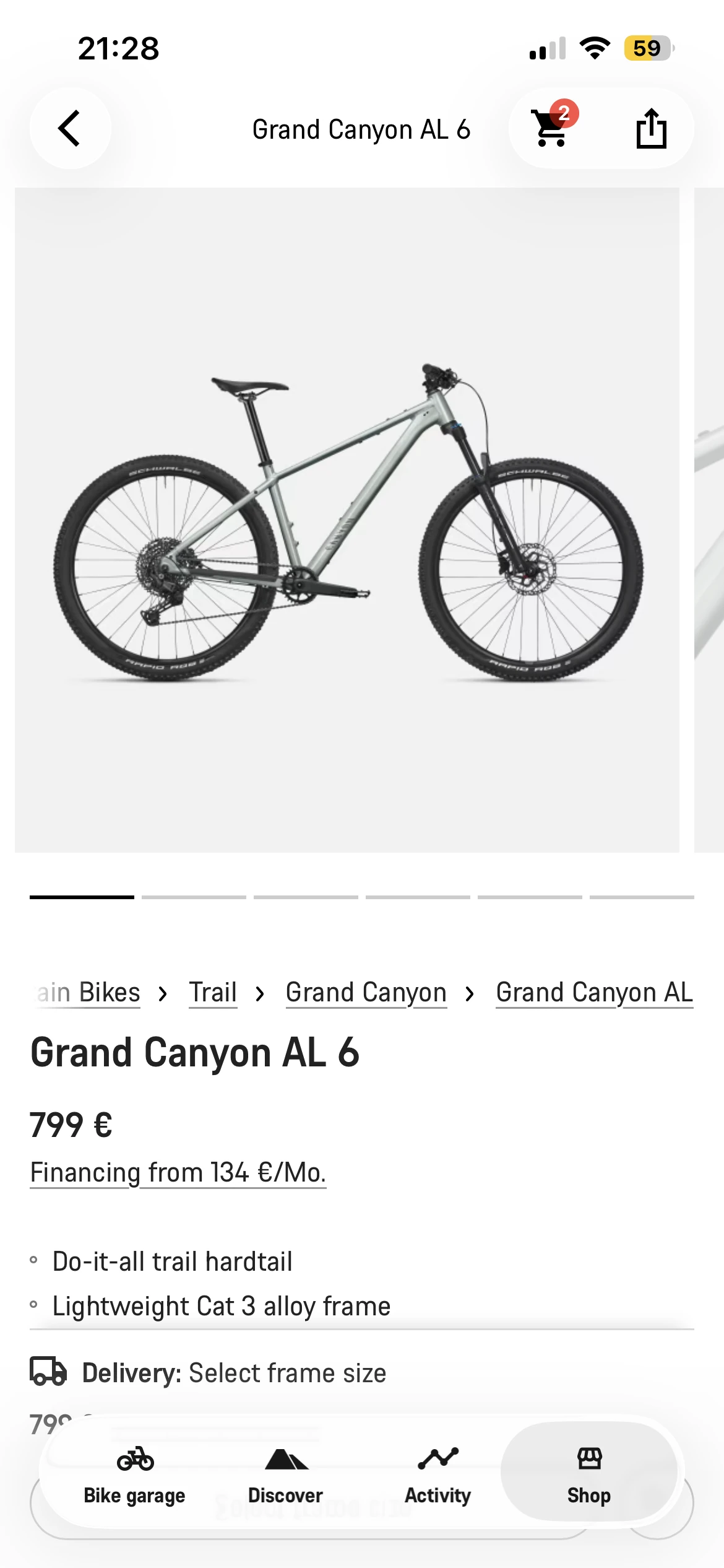
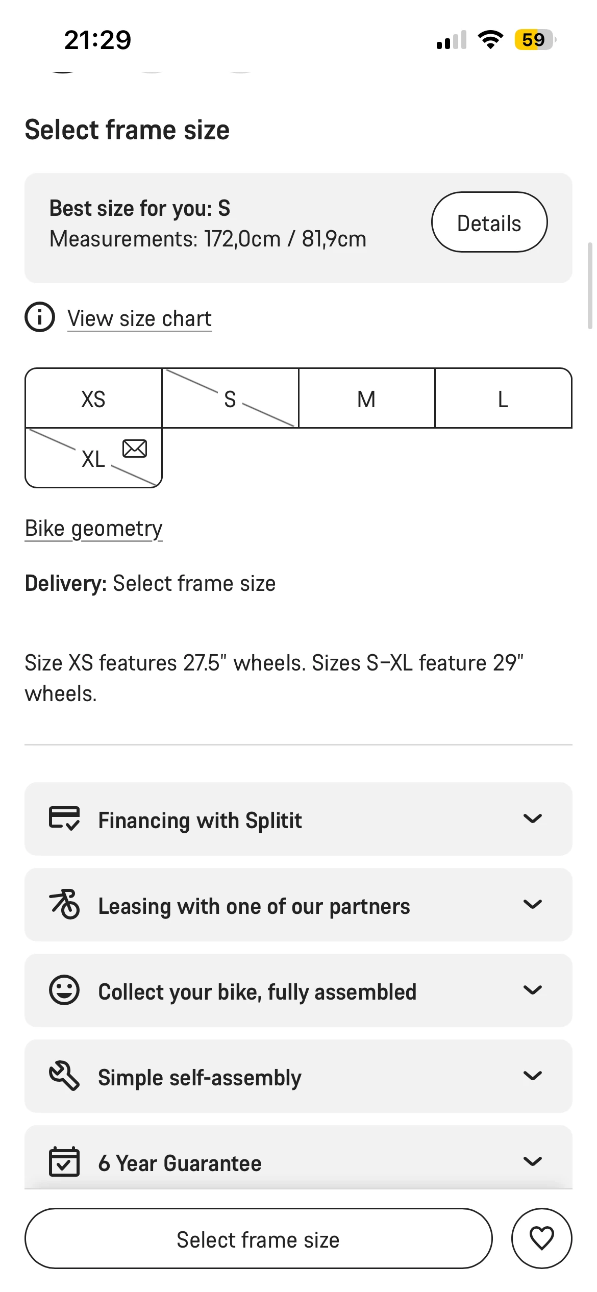
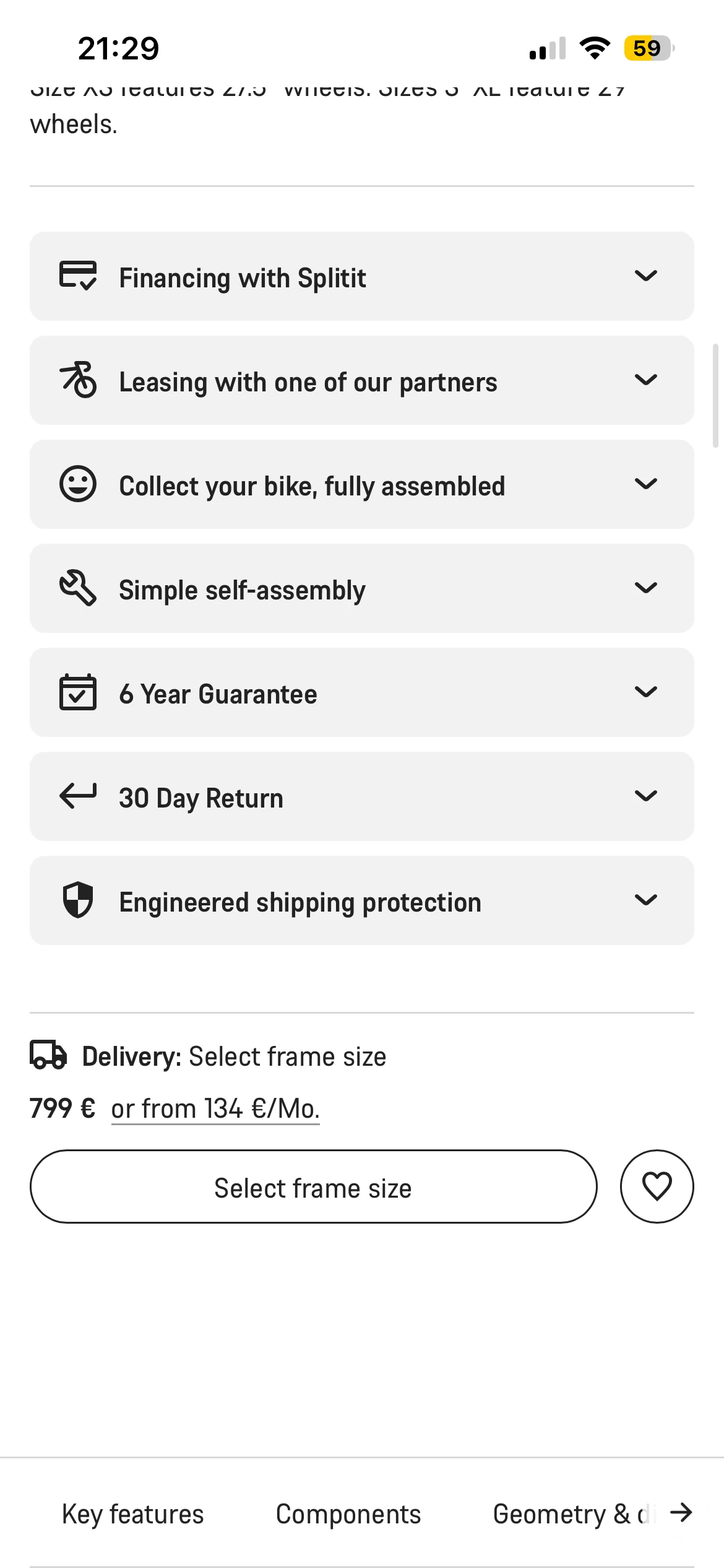
Size comes after frame shape and colour, halfway down the page, even though price, stock and delivery date all depend on it (“Delivery: Select frame size”). Test rides exist, but are promoted only by a banner at the end of the product list. It opens a general service finder, and partner cards say “Test bikes available” without saying which bikes.
Why it matters
A choice that other choices depend on should come first. Fit is the doubt most likely to stop a purchase or cause a return, and it peaks at the size step, not while browsing the list. By then the test ride is out of sight, and riders who do find it lose the bike they were looking at.
Opportunity
Make fit the first decision, and offer the test ride at the moment of doubt, for the bike on screen.
2Money
Riders can’t see what their choices cost
What happens
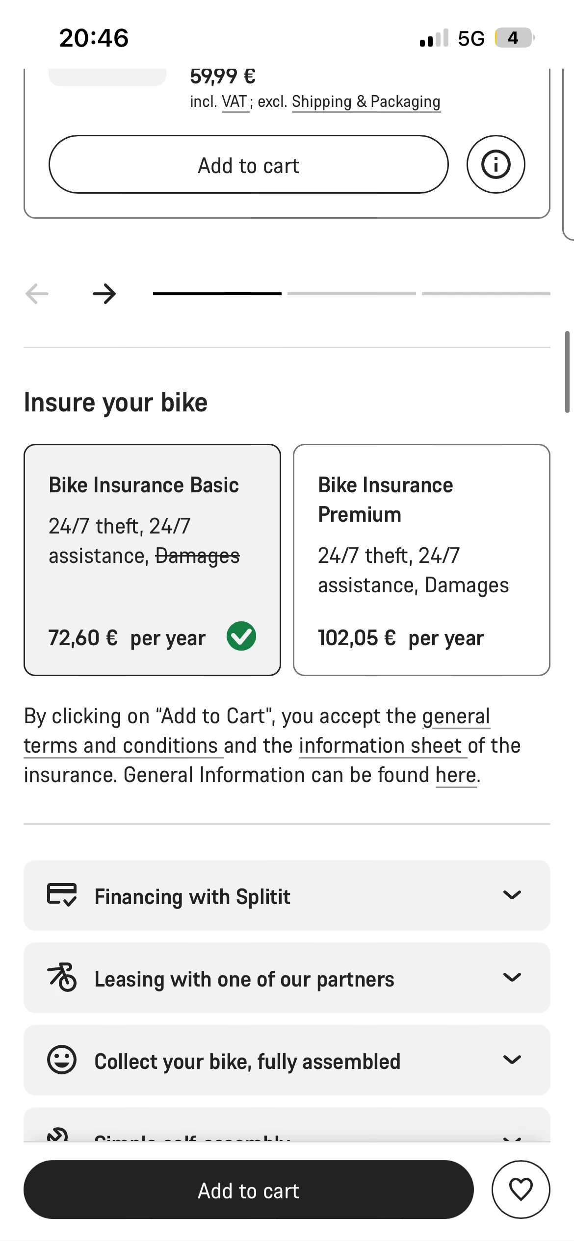
The price appears only at the top of the page. The purchase card scrolls away with the content. Choosing insurance changes the total, but the total sits in a collapsed row at the bottom.
Why it matters
People commit more easily when they see what each choice costs as they make it. A total that is only revealed at the end feels like a hidden cost, one of the most common reasons for abandoning a purchase.
Opportunity
Keep the total in view at all times, and update it the moment a choice changes it.
3Control
The page takes control away from the rider
What happens
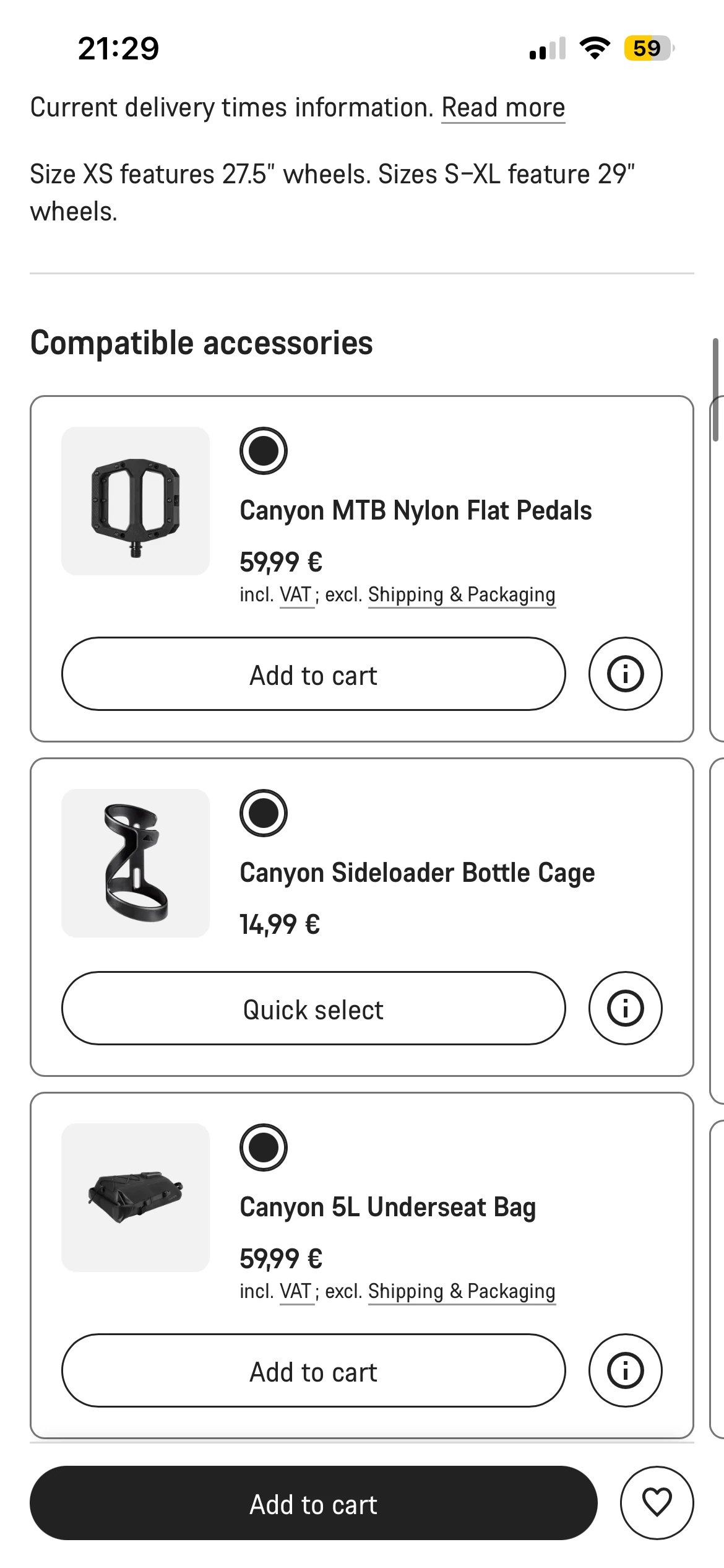
Choosing a size scrolls the page by itself to compatible accessories. The step bar (frame shape → colour → configure → customise → add to cart) is squeezed into the bottom of the screen. Insurance comes after accessories, as the last step.
Why it matters
When the page moves on its own, riders lose their place. A push toward accessories at the moment of choosing a size feels like selling, not helping, and protection for the bike comes after a bottle cage.
Opportunity
Let the rider move forward. Keep the bike’s checkout about the bike, and offer accessories on the page as products in their own right.
4Reassurance
Reasons to buy are treated as small print
What happens
The 6-year guarantee, 30-day returns, pick-up at a partner, assembly options and financing are seven closed accordions, between the options and the purchase card.
Why it matters
For a direct brand, these promises replace the shop: they take the risk out of buying unseen. Closed, they don’t reassure anyone. Stacked, they push the purchase further down the page.
Opportunity
Turn them into one row of promises a rider takes in at a glance.
Citylite
Every other bike
5Consistency
Citylite feels like a different shop
What happens
Every bike family shares one PDP template, except Citylite. It uses a different layout, different step names and a different content style.
Why it matters
A rider comparing a city bike with a road bike has to learn the page twice. For Canyon, every improvement is designed, built and tested twice, and the two templates drift further apart with each release.
Opportunity
Move Citylite onto the shared template, so every improvement reaches every bike.
One idea, five rules
04
The design principle
Size first. Price always visible.
Fit before colourThe total on every screenExtras offered, never pushed
01
Answer each question when it’s asked
Fit help at the size step, cost at every choice, promises before the commitment.
02
Decide what others depend on first
Size sets price, stock and delivery, so it comes before colour and extras.
03
Always know what you pay
The total is visible on every screen and changes the moment a choice changes it.
04
Offer, don’t push
Insurance is an optional step. Accessories are offered on the page as products in their own right.
05
One template, every bike
Bike families differ in content, not in structure.
Quick wins first, big bets second
05
Quick winsBig betsSmall fixesLaterSticky purchase barTest ride at the size stepInsurance comparisonSize-first moduleGuided configuratorCitylite on the shared templateRow of promisesAccessories on the page
Low effortEffort to build →High effort
Where I’d start
The sticky purchase bar fixes the most severe problem with the least build effort, so it’s the first thing I’d ship and A/B test, together with the test-ride prompt.
The size module and the configurator are bigger bets, but they carry the core idea of the redesign.
Positions are my estimate, to be checked against Canyon’s data.
The decisions, in the order riders make them
06
Today the price disappears after the first screen and size is a mid-page choice. In the redesign, size is the first decision and the total stays in view through every step.
Today · 8 stops, price lost after the first
Gallery, name, price
Spec bullets, rating
Frame shape, colour, size (mid-page)
Auto-scroll to accessories
7 service accordions
Insurance, last
Total hidden in a collapsed row
Add to cart
Redesign · size first
Gallery, price, 3 key specs
Your size, or a test ride nearby
Colour
Row of promises
Accessories, specs, reviews
Sheet: protection, then delivery & review
Add to cart
Sticky bar: live total on every step
Try it
An interactive version of the new product page, built from the same components as the Figma file. Pick a size, try the test-ride prompt, add an accessory, then tap “Add to cart” to open the two-step sheet and watch the total.
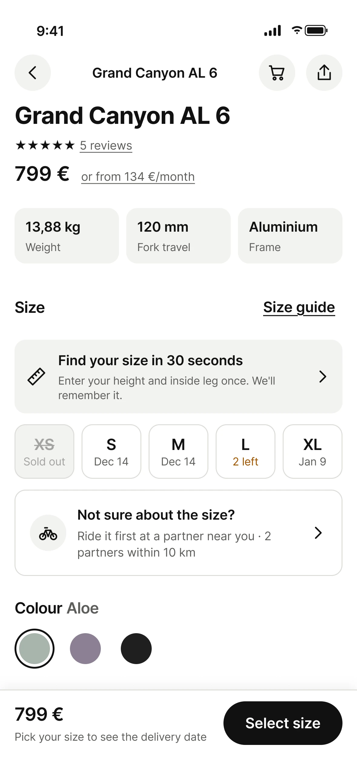
1Size first, with confidenceSize sits right under the price. With saved measurements the recommended size is pre-selected; without them, “Find your size” asks once. Each size shows its delivery date or stock before the rider picks.
2A test ride at the moment of doubt“Not sure about the size? Ride it first at a partner near you.” Opens the existing partner finder set to test rides, with the bike carried over.
3A sticky purchase barReplaces the scrolling purchase card: live total, delivery date and one action whose label follows the rider’s progress.
4A summary first, details laterName, price, financing and the three specs that matter most for this family. Full specs, geometry and reviews come after the choices.
5A row of promisesGuarantee, returns, pick-up and assembly in one glance, instead of seven closed accordions.
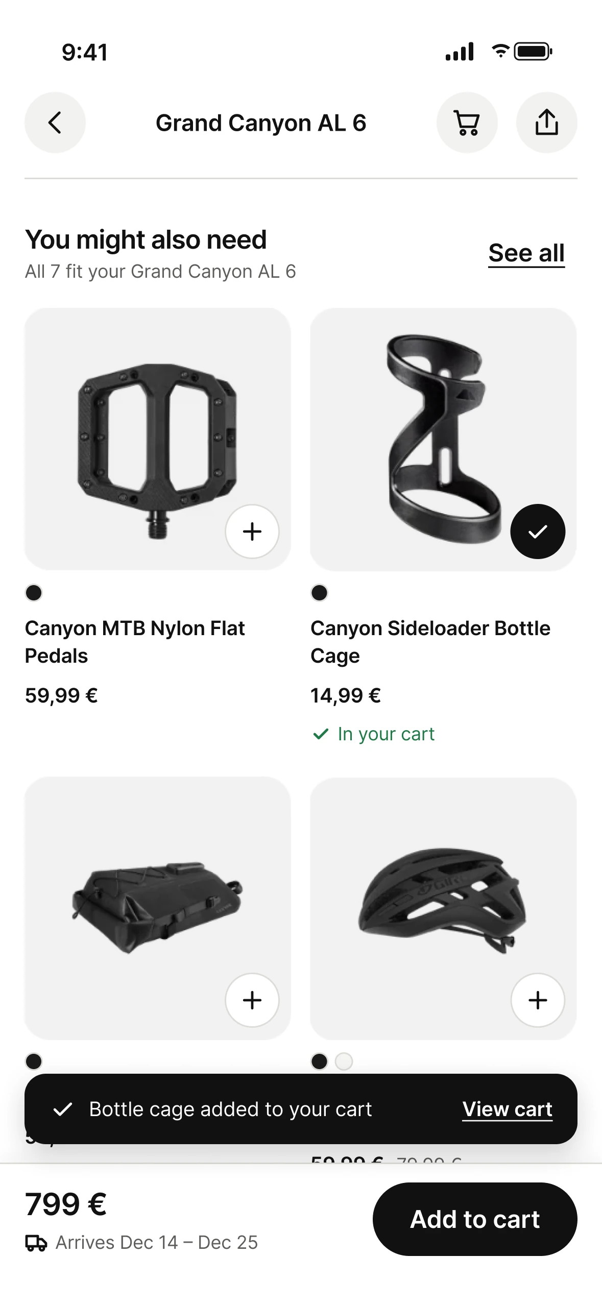
6Accessories on the page“You might also need”: photo, colours, price. “+” adds an accessory to the cart as its own item; the bike’s flow is untouched.
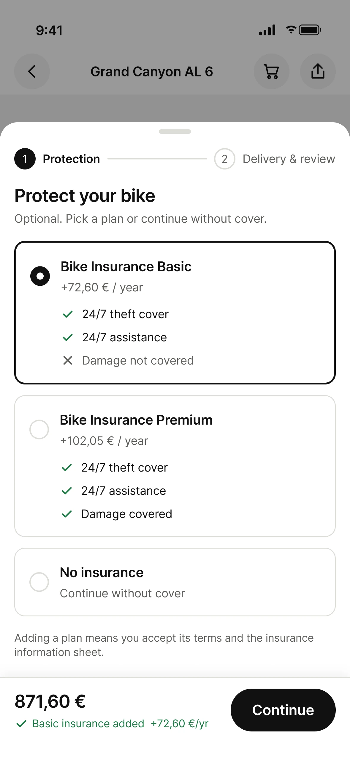
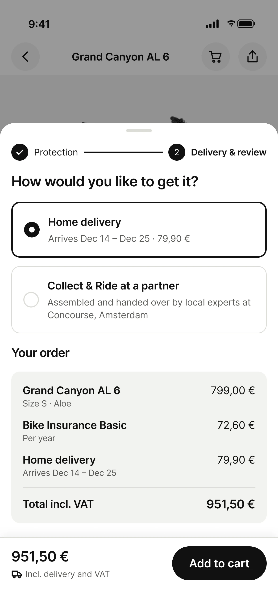
7A two-step sheetProtection, then Delivery & review. Nothing paid is pre-selected: the rider picks a plan or “No insurance”. The receipt comes last, right above “Add to cart”.
9:41
Grand Canyon AL 6
Grand Canyon AL 6
★★★★★ 5 reviews
799 €or from 134 €/month
13,88 kgWeight
120 mmFork travel
AluminiumFrame
Size
Your size: SBased on your height (172 cm) and inside leg (81,9 cm)
Colour Aloe
Highlights
Do-it-all trail hardtail
Lightweight Cat 3 alloy frame
8 mounting points for racks, bags and bottles
You might also need
All 7 fit your Grand Canyon AL 6
Canyon MTB Nylon Flat Pedals
59,99 €
✓ In your cart
Canyon Sideloader Bottle Cage
14,99 €
✓ In your cart
Canyon 5L Underseat Bag
59,99 €
✓ In your cart
Giro Agilis Road Cycling Helmet
59,99 €79,99 €
✓ In your cart
Protect your bike
Optional. Pick a plan or continue without cover.
Adding a plan means you accept its terms and the insurance information sheet.
How would you like to get it?
Your order
799 €
Interactive prototype. Scroll inside the phone and tap through it.
The key screens
01 · Size firstSize right after the price, the test ride where doubt peaks, the total in the sticky bar. Tap to see the full page.
02 · New rider“Find your size” replaces the recommendation. The bar asks for a size instead of showing a dead button.
03 · Accessories“+” adds an accessory as its own item. The bike’s total and flow are untouched.
04 · ProtectionCoverage as ✓ / ✕, cost as a yearly delta. The total updates the moment a plan is picked.
05 · Delivery & reviewChoices first, receipt last, right above “Add to cart”.
Interface copy, before and after
CurrentRedesign
Delivery: Select frame size→Pick your size to see the delivery date
Best size for you: S · Details→Your size: S, based on your height and inside leg · Why?
Come for a ride · See locations (end of the product list)→Not sure about the size? Ride it first at a partner near you
Select frame size (button)→Select size
Eight components, every state designed
07
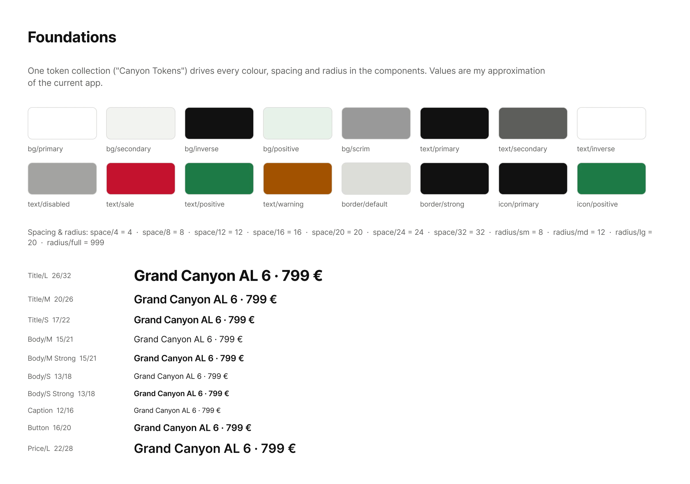
Every screen is built only from these components, on one set of colour, spacing and type tokens. Changing a component updates every screen, which is also what makes one template for every bike realistic.
Every component below is live: switch its state with the pills, or use it directly.
Purchase bar
799 €
Pick your size to see the delivery date
The action follows the rider: tap it to move to the next state.
Size selector
Your size: SBased on your height (172 cm) and inside leg (81,9 cm)
Chip states: default, selected, recommended, low stock, sold out. Tap a size.
Test-ride prompt
Opens the partner finder set to test rides, with this bike carried over.
Option card
Works as a radio group. Nothing paid is pre-selected.
Step indicator
Current, done and upcoming. A done step is tappable to go back.
Accessory tile
Sold out
Canyon MTB Nylon Flat Pedals
59,99 €
✓ In your cart
Giro Agilis Road Cycling Helmet
59,99 €79,99 €
✓ In your cart
“+” adds it as its own cart item. Sale price and colours shown on the tile. Tap a colour dot.
Toast
Grand Canyon AL 6 added to your cart · View cart
Slides in for 2 seconds, then hides. Pick a message to replay it.
Promise row
Icon + label. Each item opens a detail sheet. Tap one.
Buttons
Primary, secondary and link, with pressed and disabled states.
ComponentVariants and statesReplaces
Purchase barNo size · Ready · Updating total · Sold out · In cartScrolling purchase card
Size selectorRecommended · Selected · Low stock · Sold out · No measurementsSize grid + recommendation box
Test-ride promptPartners nearby · Location off · No partner nearby“Come for a ride” banner
Handover: one spec page per component (anatomy, tokens, states, behaviour), plus written rules for the purchase bar: when it appears, how the total animates and what it says in each state.
How we’d know it works
08
“Do riders choose a size and reach the cart with more confidence, without Canyon losing insurance and accessory sales?”
MetricWhat it tells us
01Add-to-cart rate from the PDPThe main success measure
02Returns because of the wrong sizeShould fall if the size module works
03Test rides booked from a PDPWhether riders find the test ride at the moment of doubt
04Insurance and accessory uptakeThat moving accessories out of the checkout, and making insurance optional, hasn’t cut revenue
A/Btests, starting with the sticky bar and the test-ride prompt
4metrics Canyon already has the data for
0riders tested yet; a comparative test is the next step
What I’d check before shipping
09
This is a redesign made from the outside, so its biggest limit is that I didn’t have Canyon’s data.
Assumption 01 · Size step
Riders hesitate at the size step
The redesign assumes many riders leave the PDP at the size choice.
Check: funnel data from the size selector to add-to-cart.
Assumption 02 · Test bikes
Canyon knows which partner has which bike
The prompt is strongest when it can say which partner has this bike to test.
Fallback: send riders to the nearest partners with test bikes, and let them confirm when booking.
Assumption 03 · Accessories
The scroll to accessories was a sales decision
Moving accessories out of the flow may lower their uptake at first.
Guardrail: track accessory uptake from day one, and test a short “riders also add” moment right after the bike is added to the cart.
Constraint · Legal
Legal text moves, it never disappears
Insurance terms and the information sheet sit next to the choice they belong to. Nothing paid is pre-selected.
Check: wording and placement confirmed with Canyon’s legal team.
The takeaway
Size first. Price always visible.
Canyon’s app didn’t need more content. It needed each answer to arrive at the moment the rider asks the question.
Size first+Test ride at the moment of doubt+Sticky live total+Row of promises+Two-step sheet+One template
Next step
Test, then ship in slices
A comparative test of the current page and the prototype with riders of different sizes.
A/B test the sticky bar and the test-ride prompt first: highest impact, lowest effort.
Bring the same principles to the product list, filters and compare.